Introduction
Londoners Pub is a little slice of the UK in Prague that serves Czech beer, imported ales, and delicious pub food. They had closed and reopened several times, and their previous branding revealed clear opportunities for critical improvements needed to stand out in one of Europe’s most competitive hospitality markets.
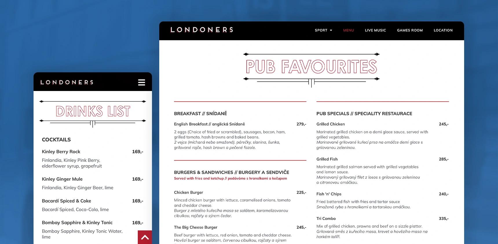
With new management ready to make an impression, they reached out to us for a complete rebrand, including new menus, signage, and a custom-built website. The challenge was to create a modern, cohesive brand experience that balanced contemporary design with the pub’s British-inspired identity.
Our Approach and Build
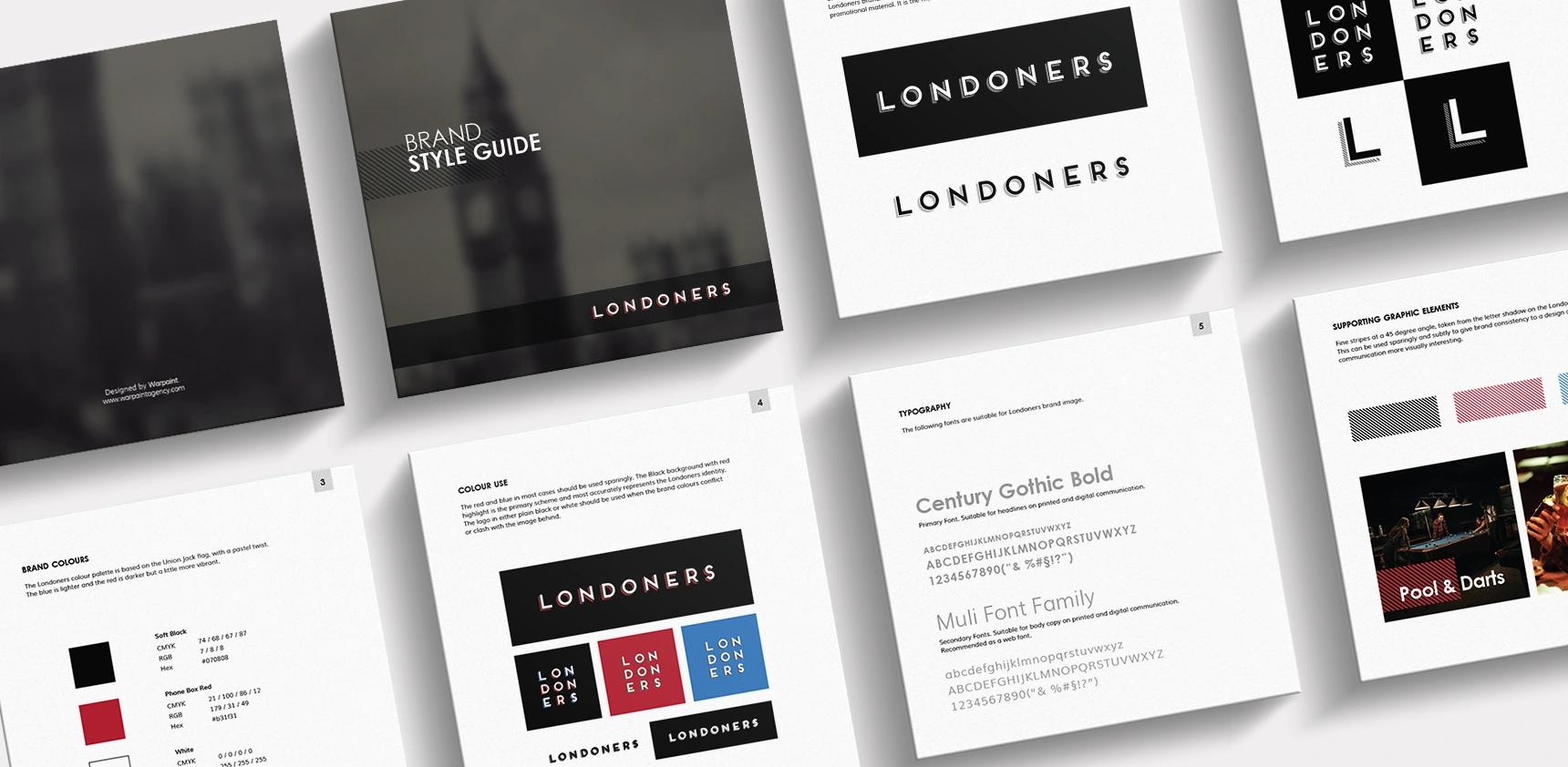
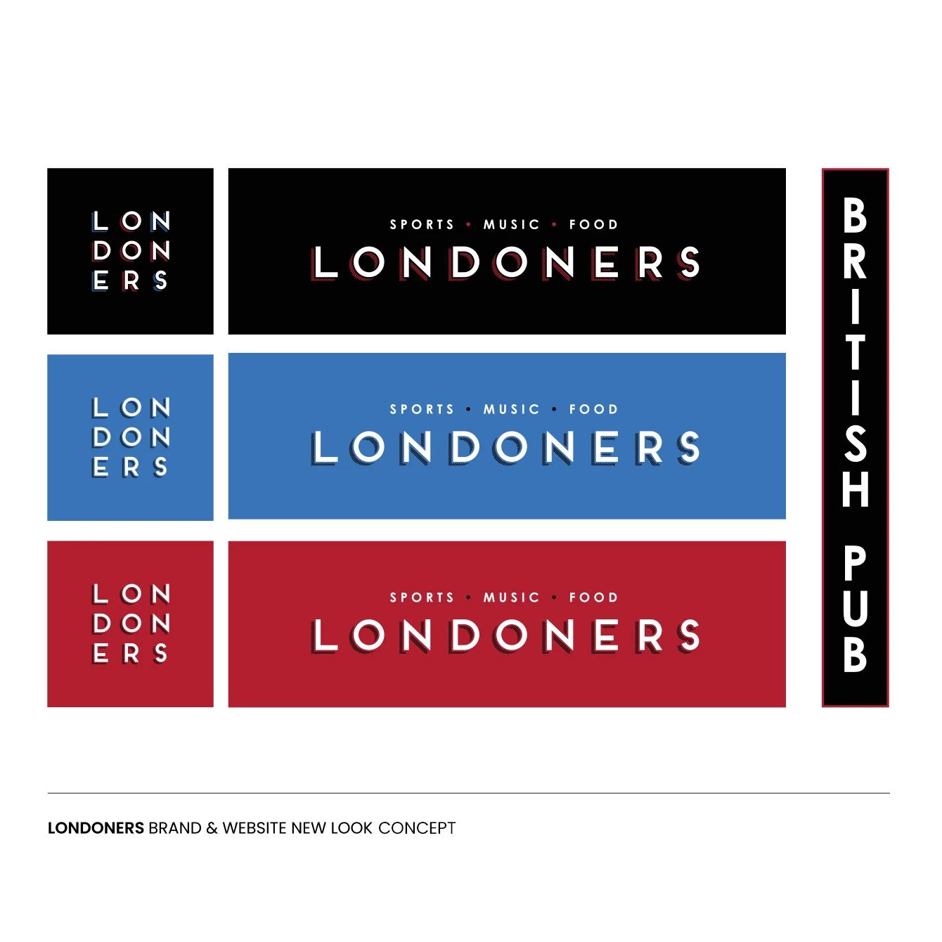
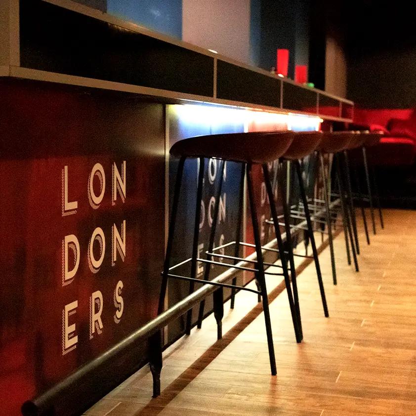
We started by stripping the brand to its core: what people love about a true pub: warmth, reliability, and good company. From there, we improved their logo and adapted it into the grid version, developed a colour palette and typography that feel familiar but clean and modern.
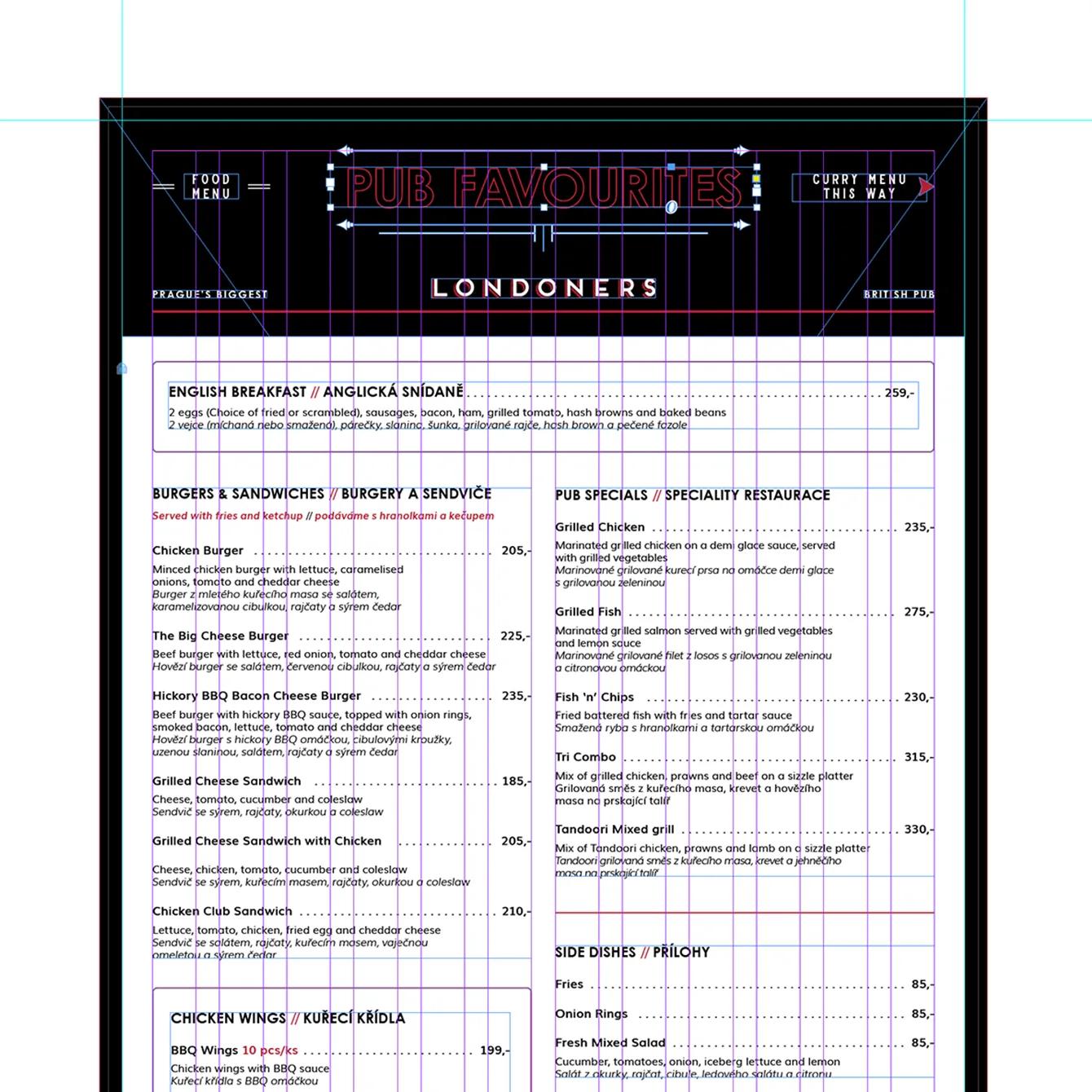
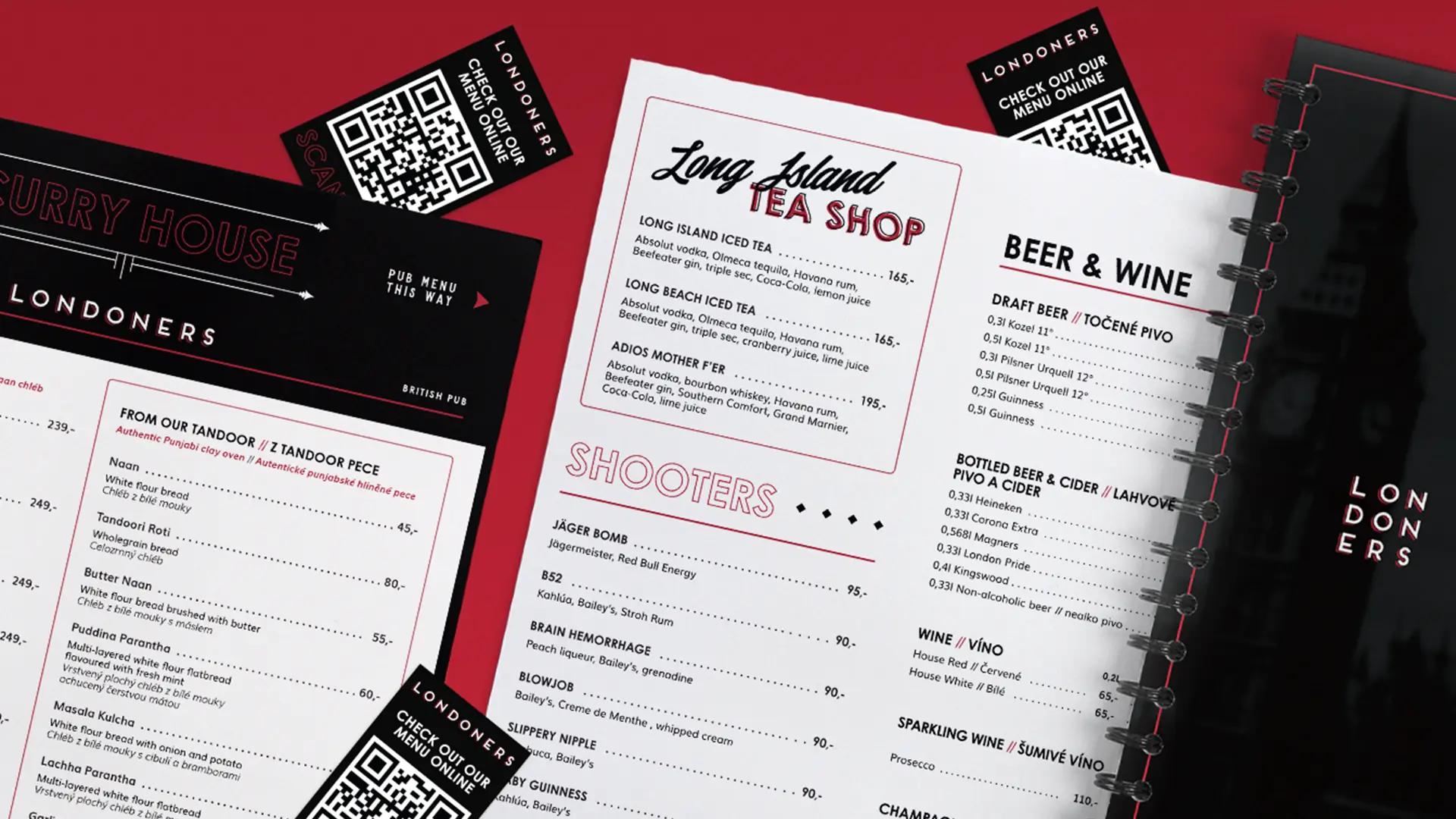
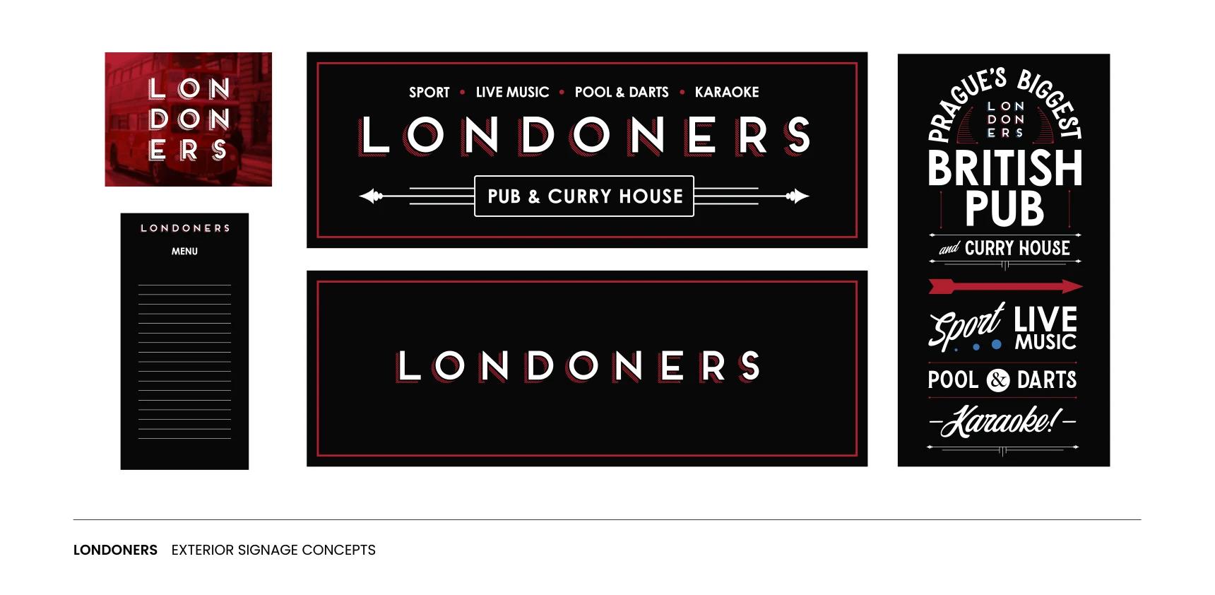
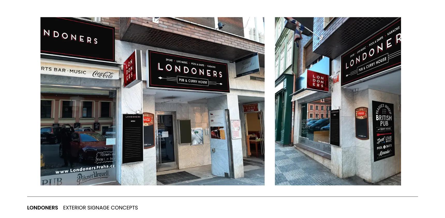
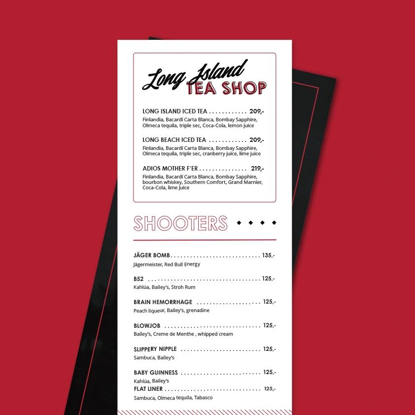
We built new menus that are easy to read, simple to update, and consistent with the visual system. Signage followed the same structure with clear typography, strong contrast, and durable materials suited for outdoor use.
The website tied everything together. It’s fast, mobile-first, and built for easy management. Guests can view live menus, events, and sports schedules through QR codes that connect the print materials with the site. Every element serves a purpose: simple navigation for visitors, simple updates for staff.
Impact
Londoners Pub now has a clear identity, inside and out. The design is now in line with their vision and the quality of the service, and their website brings steady traffic from both locals and tourists. The team can manage updates without support and keep guests informed in real time. Outdoor signage and print materials reinforce the same aesthetic, helping Londoners stand out in Prague’s lively centre.
The owner, Pulkit Walia, shared:
“Great experience working with Warpaint Creative Agency. Website done with great design, great communication. Highly recommend.”
For us, this project was more than a redesign, it was about giving new life to a local favourite, one pint, one pixel, and one great story at a time.